Minidini
Jun 11, 2018
Minidini
Dominik Szakacs, Marcial Koch, Colin Schmid
Basic GUI Course
Bachelor Interaction Design, 3rd Semester 2018
Lecturers: Jürgen Späth, Joël Gähwiler
Project Introduction
TLDR: Minidini - Inventory Management App for Shared Households (UI/UX Design Project)
Co-led a team in designing and prototyping a web application for Migros to address issues in shared households, focusing on inventory management and property division. Conducted extensive user research through interviews, surveys, and field studies to identify key pain points. Developed wireframes, user flows, and a clickable prototype using Sketch and Abstract. Created a modern UI inspired by Migros' Micasa furniture store, emphasizing simplicity and intuitive design. Implemented user testing with the «Thinking Aloud» method to refine the app's functionality. Built a functional prototype using Node.js, Express, and MongoDB, demonstrating skills in full-stack development. The project showcased abilities in user research, UI/UX design, prototyping, and agile development methodologies, while addressing real-world challenges in shared living situations.
Detailed Project Documentation
01 Introduction
For our introduction to the field of Graphical User Interface Design we were briefed to design and prototype a web application that solves issues around the living in shared households. Our fictitious client would be Migros. In contrast to previous semesters we would be entirely free in the conception of functionality as well as visual design of our application. Our second year cohorts had redesigned the SBB ticket machine, we where going to be the first class to tackle the Migros app. With Migros as a client we had to follow one of their corporate identities with our visual design.
02 Desk Research, Field Research, Findings
Desk Research
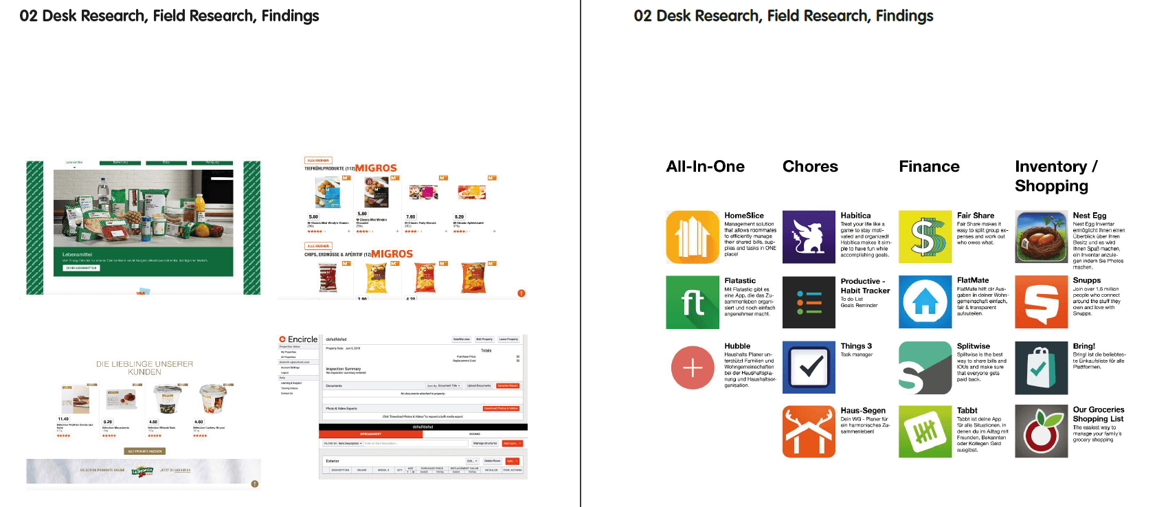
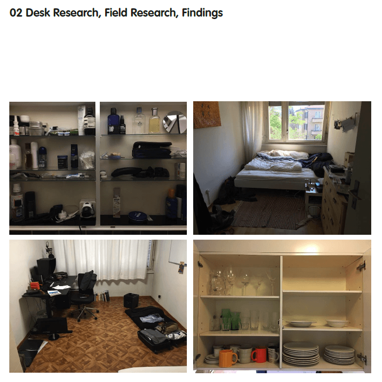
At the beginning of this course we made some research of Migros market presence and existing applications. We wanted to find out that kind of applications are around with regard to shared flats. Some of them were analyzed and tested by us and that gave us a better impression. We came across to various apps during the first research in terms of a shared flat and we have set our focus more on the inventory and financial area. Apps like «Splitwise», «Bring!» and «Nestegg» were quite exciting in terms of functions. Therefore, we wanted to create an app by taking out the strengths of each app and combining them into one. Our main-goal was to develop a simple, smart and minimalistic designed app despite the range of functions such as tables charts and so on like in excel or numbers. And that was for us a challenge. We have also come across to similar applications related to itemized property. The issue for us was that they were quite user-unfriendly and you get quickly overwhelmed. In some areas on the screen just happens too much and reminds us quickly on an Excel-Sheet, that we tried to prevent with our implantation. We also talked to people living in a shared flat and they told us many stories that helped us further. This allowed us to collect many impressions and set the focus on a problem that almost every flat share has. Namely that almost all furniture and appliances were bought together and when a flatmate is planning to move out, they usually forget who owns what. These methods helped us a lot to understand their motivations and behaviours. We also analyzed their home and took some pictures for our documentation.
Field Research
Dörflibeiz is a flat share in Oerlikon. Since September last year there are three young men from Graubünden living there. Marc has lived there the longest, he has seen a couple of people move in and out again as they finished their studies or changed jobs. He has studied at the Pedagogic University in Chur and then moved here for a job at a refugee center. Manuel was the second to move in, he’s from Graubünden too and studies Industrial Design. The third flatmate is Colin, he studies Interaction Design. The three of them where friends long before moving in together, they understand each other great. There is a lot of banter and the general atmosphere in the flat is very good. At times there’s discussions about things that might bother one or more parties, but not the others. These discussions can get heated, but are always resolved relatively quickly to the content of all. However one ongoing issue was the cleaning of the flat. Initially they held a planning meeting for this and decided a rigid plan would not be necessary, they’d just clean whenever necessary and make sure each does his part. If it would turn out to be necessary, they could always come back and implement a plan. Soon this turned out not to have been such a great idea. Parts of the flat, like the kitchen stove, floor or the bathrooms where not cleaned for weeks sometimes. It turned out, Colin had quite a different understanding of cleanliness. He certainly was the one doing the most cleaning in the flat, all of them agreed to that. Marc and Manuel did not think it necessary to clean more often. They simply where not bothered by the state of the flat. Marc then decided to pay the others instead of contributing this part. A few weeks later this idea turned out not to work so well for him. Colin wanted him to hold the promise and pay him for the work he did. Marc however thought it was not fair to pay Colin while Manuel did neither clean nor pay. After another month or so they sat together with Andy, a close friend as a mediator. They decided to divide up the work. Colin would stay responsible for the bathrooms, since he did not mind the work and had high standards. The other two would rotate between cleaning the living room and all floors except personal rooms and bathrooms and the kitchen as a whole. They had a bit of a haggle in terms of regularity, but compromised to a by weekly rhythm. So far this has worked out pretty well. The flat is much cleaner then before and the clearer responsibilities allow for holding one person accountable if there is an issue.
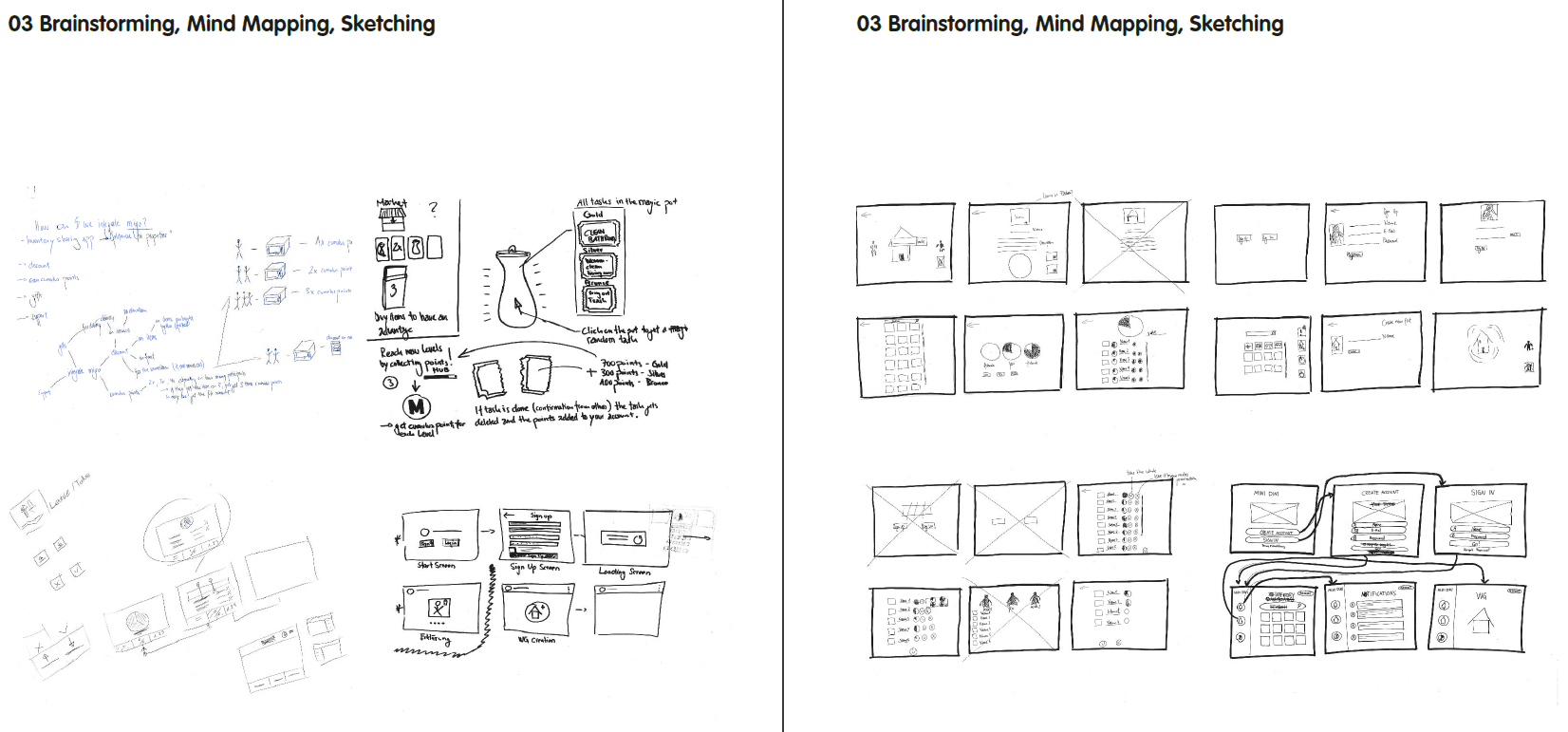
03 Brainstorming, Mind Mapping, Sketching
Conception
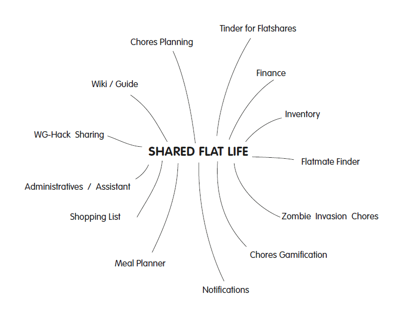
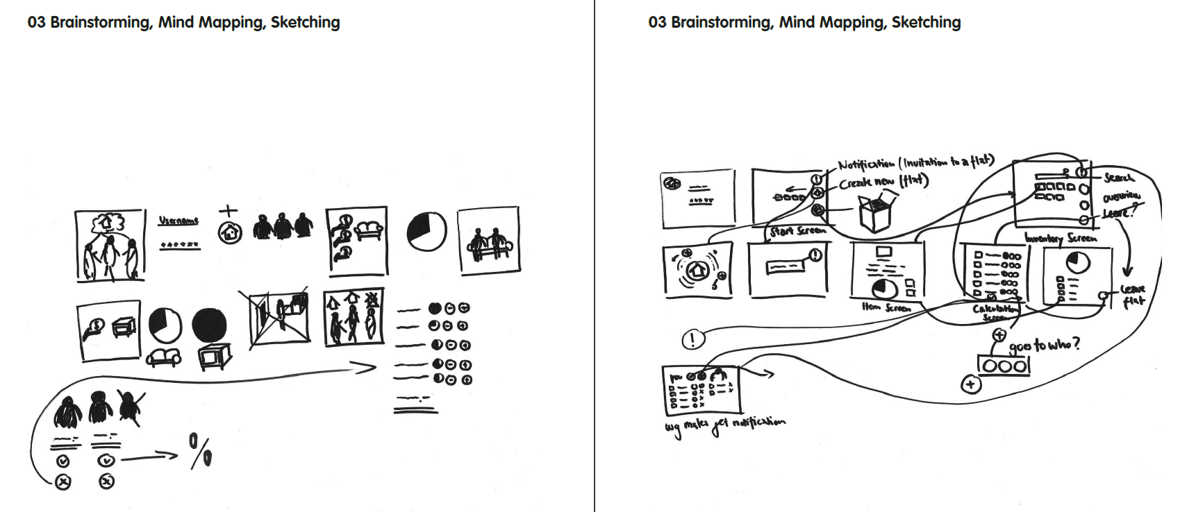
To get familiar with the topic of designing a web application for a shared flat, we did a short survey about strengths and troubles in living communes and send it to our friends. As a conclusion it can be said that most of the problems concern those topics in the following mindmap. One very interesting response was about the problem of moving out. Living for 5 years in the same shared flat leads to a lot of open questions in terms of properties. Which object has bought who? What happens with the items all bought together? At this time we came up with two idea. The first one is a gamification of chores division. There is a virtual magic pot in the middle, which contains all the chores on little notes. Everyday all flat members have to shake this magic pot to get a chore. To brainstorm in this direction was very inspiring for us, but we realized, the work behind this project is more creating a game mechanic than a graphical user interface. The second idea is an application to manage shared items. Important here is the timeframe of moving out. Most of people might not see this as a real problem, until they move out. We also think about implementing an impairment over time. How we can connect this concept with the Migros brand? So you are four flatmembers and buy together a electric device in Melectronics. After some years one decide to move out and gets paid by the other members for his part property of the device. Now the one, who moved out gets discount on electric device to buy his own.
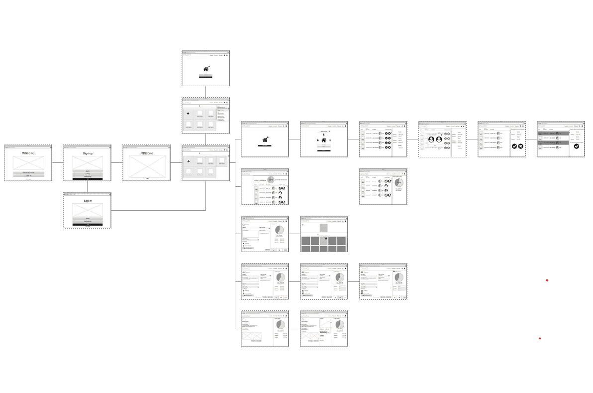
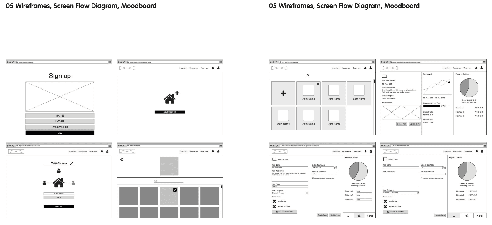
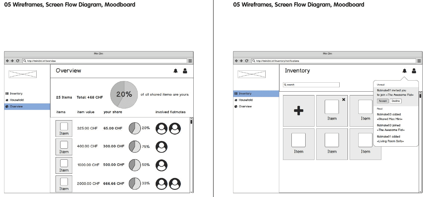
05 Wireframes, Screen Flow Diagram, Moodboard
Using our personas and all the knowledge from our field research we wrote user stories to discover the actual features our application should have. From those we would then draw a first iteration of wireframes. Pretty soon we had some fundamental, partly rather fierce discussion around structural decisions about the layout we had to meet. One of them was having a persistent sidebar on the left for main navigation or more of a tabbed browsing experience with a sticky bar of tabs on the bottom of the screen. After a sleeping over it and gathering some inputs from our mentors we compromised on a more classical top right navigation. Moving on from the first hand sketches we used Balsamiq for quickly assembling the wireframes in a digital form. The file quickly grew large and had considerable complexity with sometimes more than a hand full iterations of one single view. Despite some hardship at times we managed to come up with a well structured set of wireframes in the end. We then proceeded to assembling the screen flow diagram in Sketch. Balsamiq did not only harvest love from us. It’s clunky at times and can be immensely unsatisfying to an aesthetically trained designer. With time we let our standards somewhat lower and where satisfied with the speed by which it allowed us to churn out wireframes. For creating a visually pleasing diagram however we all where settled on using Sketch.
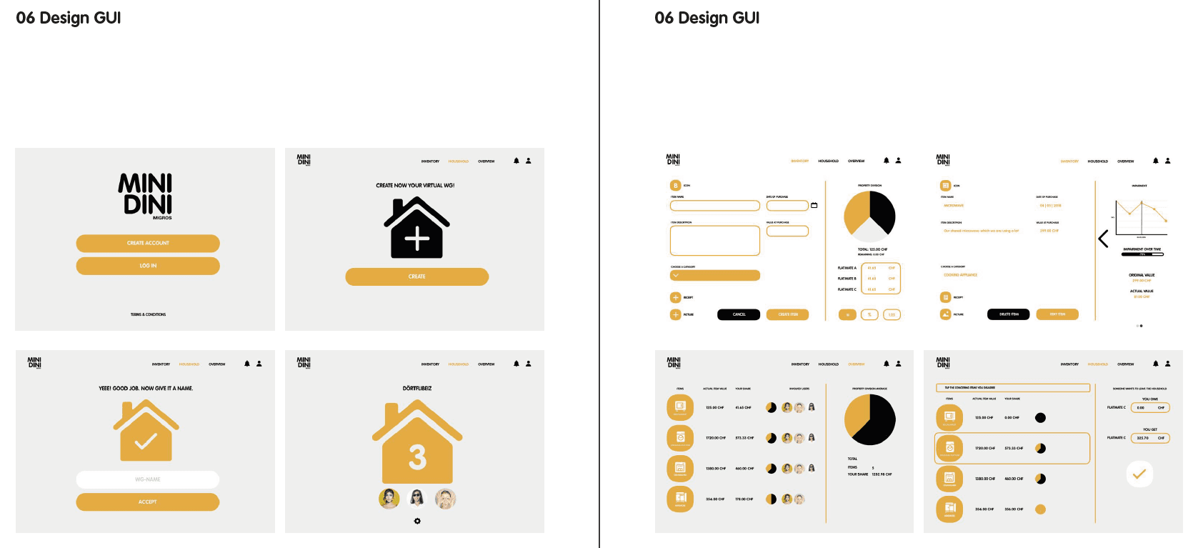
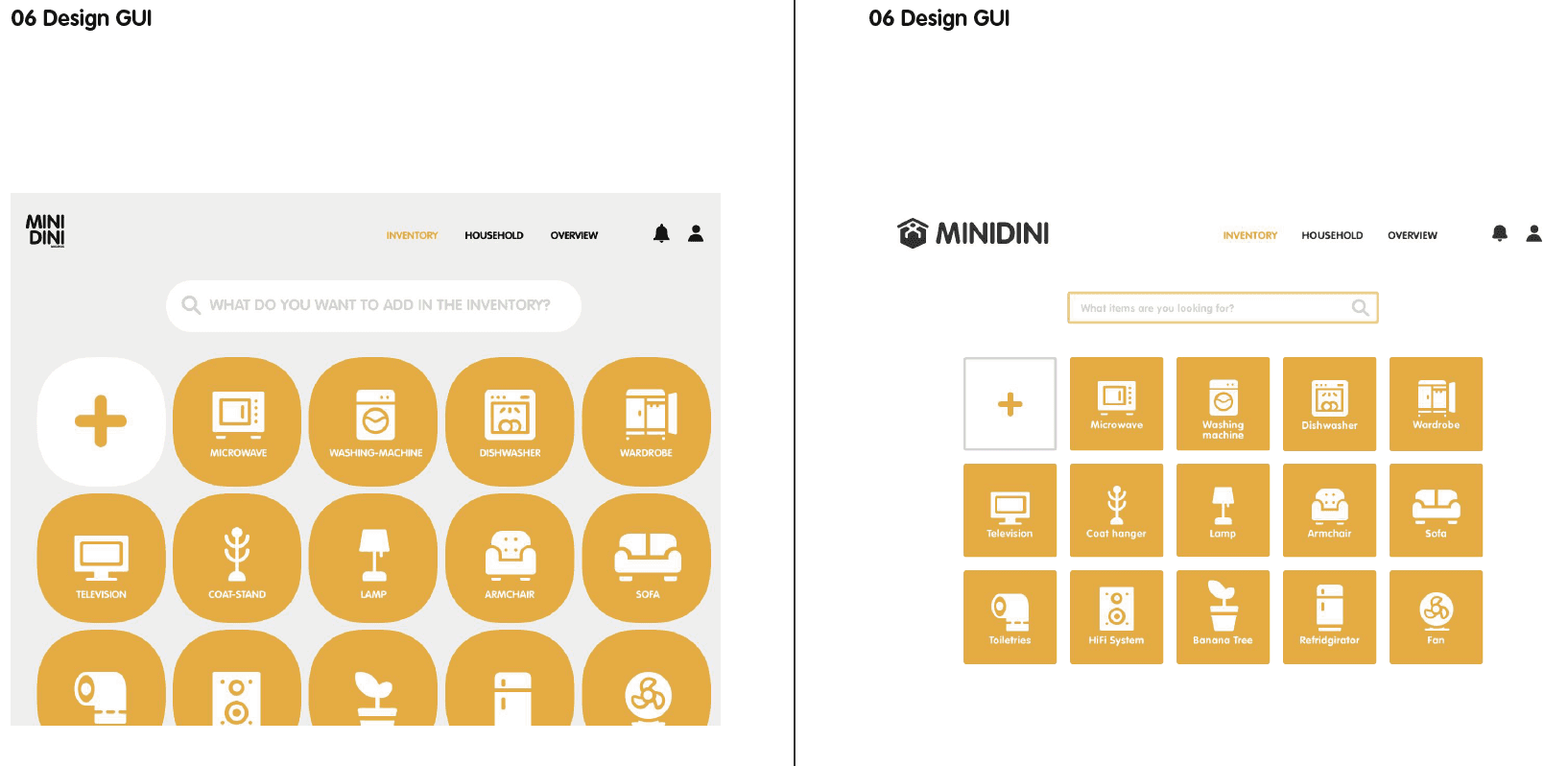
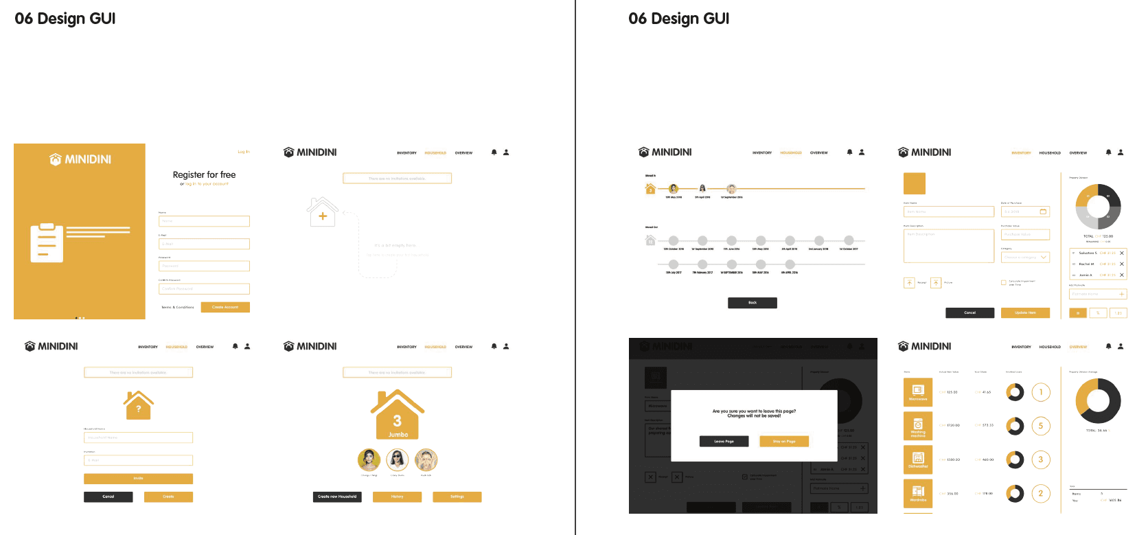
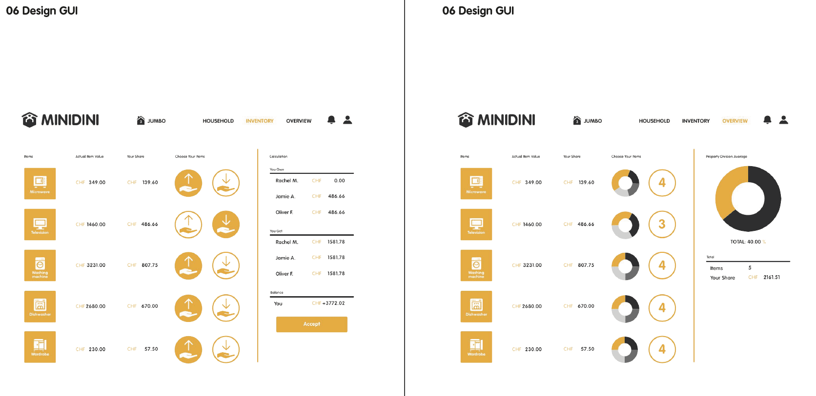
06 Design GUI
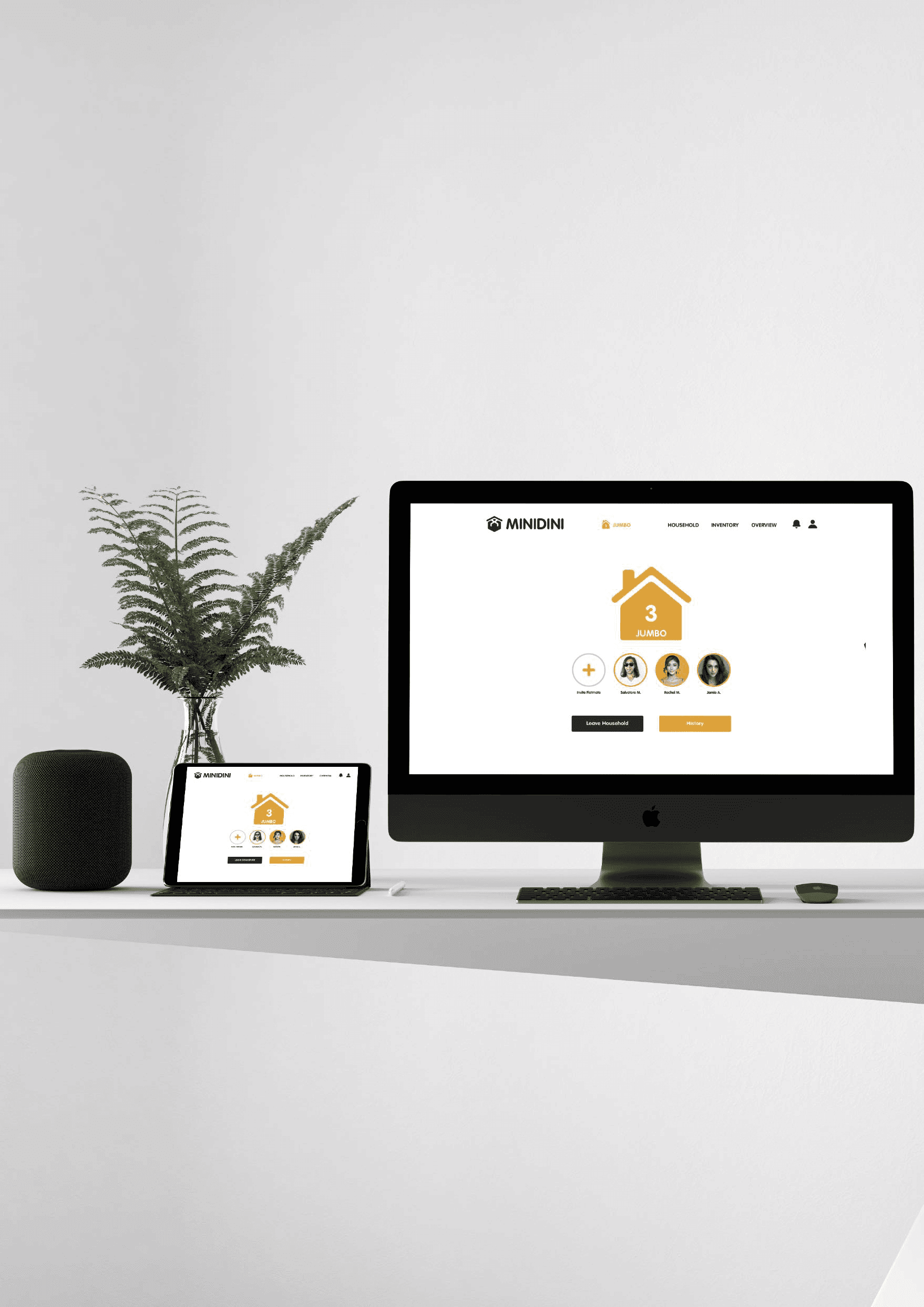
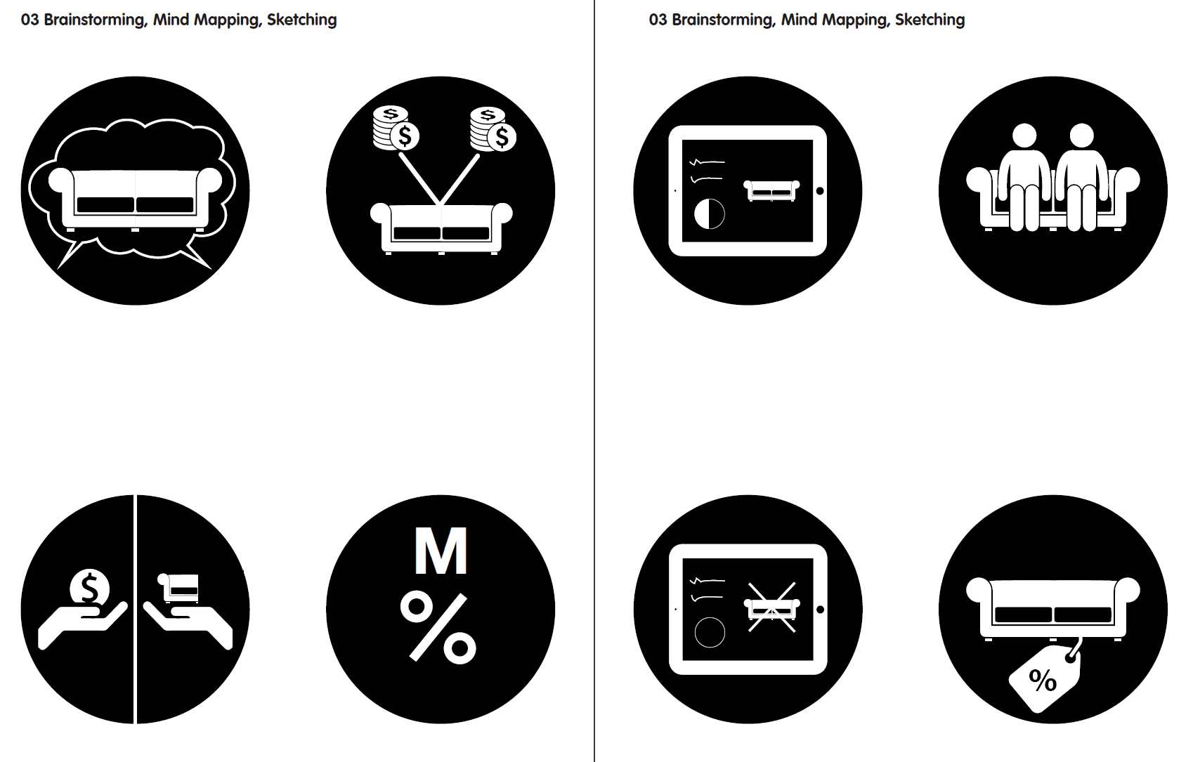
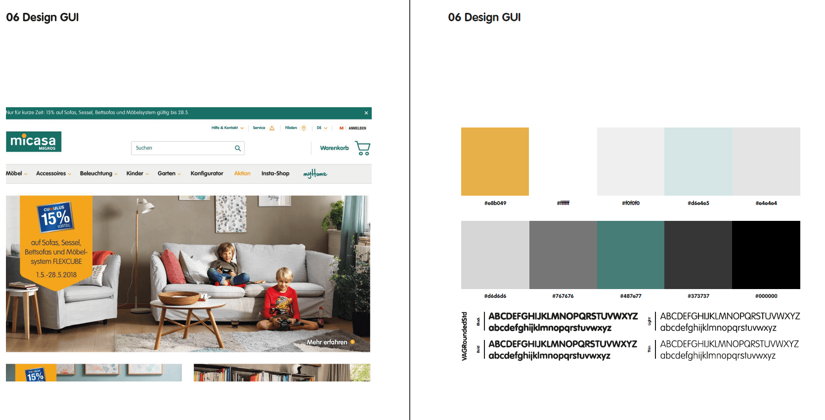
We had ourselves inspired by Migros' Micasa furniture store and thereby designed the colour concept. We took care of the visual language of the icons, buttons and images. Our intention was to create a recognition value with Micasa design. In our opinion, the modern design also fits very well because it appeals more to young people living in a shared flat. It was also a challenge to display a lot of information on one page without overloading it. Many applications we have analyzed have had exactly this weakness. That's why we wanted to create a lot of white space and build the lists with the datas intuitively. Consistency was also very important in our UI design. The black buttons, background, icons should rather symbolize the "negative". For example, if you want to leave the household, go back, cancel, delete or if something is not active. The golden/orange colours should therefore be exactly the opposite. Naturally, the size of the buttons also had to be right so that they could be seen and operated. We worked with the program sketch and were all quite impressed and were able to use it very well when designing the UI. It made our work considerably simpler because we had supported each other and learned a lot together.
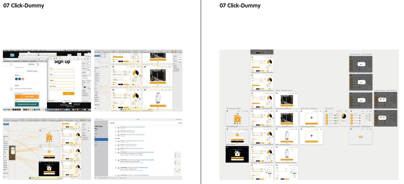
07 Click-Dummy
Software
For the click-dummy we worked in Sketch in collaboration with Abstract. Abstract is a software which was developed for Sketch to work as a group on the same file. We had to create branches out of the master for every feature we wanted to implement. After finishing the task we had to merge our branches with the master. We would recommend to work with Sketch and Abstract. They are easy to handle and it is really easy to go steps back without deleting the newer features. Dominik showed us Plant as an alternative for Abstract. It would be worth taking a look at. For loading the click-dummy in the iPad we used Sketch Mirror, which we totally not recommend, because it is lagging a lot and is not that smooth.
Process
The development of the click-dummy was extremely dynamical, since we worked all together on the same file, we were up to date immediately and could comment changes or proposals from each other. In principle we had three states, first click-dummy originated by the wireframes with a very short user test scenario of adding a new item to the inventory, second click-dummy which was improved graphically and technically by the user test and the mentorings. The third and last click-dummy was used for the screencast with a longer user test scenario, which will follow on the next paragraph, but still also this one is not finished yet. We have noticed many other things during the process of the third click-dummy. For example we agreed on the critic that in some screens there is a lot of white space and in others screens, like the item screen, there is happening too much. Unfortunately the delete button for items is missing. If we had more time we would definitely improve the item screen by splitting the input and calculation area into two different screens.
Click-Dummy Scenario
1. Salvatore creates an account
2. Creating a new household and name it «Jumbo»
3. Invite Jamie and Rachel to the household
4. Gather newly purchased microwave, choose the right category, upload picture and receipt
5. Add Oliver, who does not own the application as a part owner of the microwave next to you, Jamie and Rachel
6. Split the microwave: Salvatore owns 40% and the rest each 20%
7. Add the item to the inventory
8. Add some more items
9. Create a second household
10. Leave the household «Jumbo»
11. Decide what you want to leave in the flat and what you want to keep, just keep television
12. Looking into the proposal from Rachel (Notification)
13. Accept the proposal
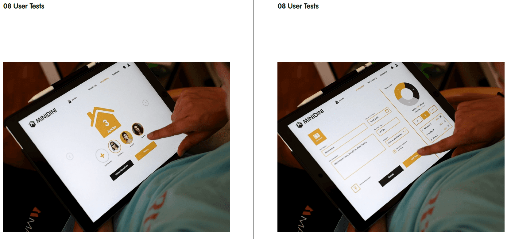
08 User Tests
Once we had the first iteration of our click dummy ready we prepared for out user tests. The scenarios and supporting texts where ready on the server and we uploaded the click dummy to Sketch Cloud to test it on the iPad. In order to gain as much valuable insight from the tests as possible we used the «Thinking Aloud» method, Jürgen had showed us in an input seminar. The tests are recorded by taking notes, usually by audio and video. The user is asked to think aloud during every action he is taking. This methodology allows for quick discovery of design flaws. Luckily Colin’s two flatmates agreed to participate in the user testings. We scheduled them at their flat, first Manuel was going to have a go, later Marc. We used a DSLR camera, tripod, film head and external audio recorder. In the filming with Marc we even had an external video recorder that allowed for much greater quality. Once the footage was edited and colour graded in DaVinci Resolve we evaluated it and took notes for improving our design. Many of the findings we gained from the tests may seem trivial, but we are convinced that many of them would not have happened where it not for the tests. Probably the biggest change we made was having the user land on the Household page rather than the Inventory, in order to avoid confusion and make it clear that a household should be created first. The form for adding items was conceived as highly user friendly, however the sidebar for property division added quite a bit of complexity to the screen. We considered extracting the sidebars into their own views but eventually left it open for the future in favour of putting our efforts into refining the other parts of the project, such as screen cast and prototype. Preparing and conducting user tests was a great exercise for us. We where expecting it to proof worthy but where still surprised by the value it had eventually. There are some important things to consider when conducting these user tests. The video production should not get into the way of the actual testing. Our decision to stick with fairly minimal equipment ensured this. Still our selection of camera, audio recorder (Zoom H6), microphone, video recorder (Atomos Ninja 2) and editing software allowed us to have fairly high production quality. Then of course the footage has to be evaluated carefully and choices made, which feedback to incorporate and in which way.
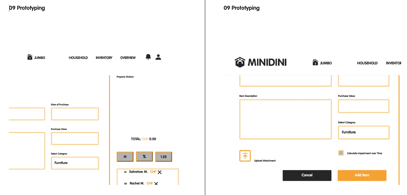
09 Prototyping
For coding the prototype we decided to split up the workload. Since he already had a bit of prior experience Colin set up a backend whilst Marcial and Dominik focused on the HTML and CSS components. When prototyping web applications it is essential to be able to move quickly and in an agile manner. A carefully selected tech stack can be crucial for minimal setup times and a rich ecosystem with plenty libraries to draw from. The way we tackled this task was quite agile. We defined sets of core features we would like to see in a proof of concept prototype and split the workload up. In a first stub Colin had started building on the MERN stack. At some point he got stuck with React and the other team members therefore joined in. This allowed us to build our own custom stack from the ground up within a few hours. We collaborated with git via Github, as is the industry standard nowadays. Knowledge transfer was important, but we had to find a balance here. Grasping git when using it for the first time can be tedious. We made sure all team members knew enough to facilitate efficient collaboration. The knowledge we had gained from the Bits & Atoms courses proved immensely valuable when it came to HTML and CSS. Dominik and Marcial where contributing the code and Colin then refactored it into the views and routes. For the backend we used Node.js to make sure all the afore mentioned requirements are met. It is the fastest prototyping tools when it comes to fairly complex web applications. Regardless of the many regrets it’s father Ryan Dahl has uttered short time ago. As an http server and for handling backend rendering of the views we used Express. The views where refactored from pure HTML and CSS into reusable components and rewritten in Handlebars.js. For persistent storage we ran a MongoDB instance to which we talked using Mongoose. It sometimes was a bit fiddly to get all the moving parts right, but we made much faster progress with leaving React out. More experience would have proved very helpful there. Still we where quite happy with the result. It features a nice RESTful api and adheres very much to the SOLID standards. It would be fun to further develop it by adding more features and maybe some day even throwing React back in there to allow for some of that isomorphic goodness, reactiveness and thereby improving the overall user experience.
10 Conclusion
Retrospectively the course was a pleasant and informative experience. Our early decision to go with the inventory app rather than putting the bulk of our efforts into designing game mechanics proved wise. We where able to train many essential skills for graphical user interface design. The work can be tedious at times and discussions fierce, but having an overall very positive climate helped our team getting through rough patches. Analysing a problem in field research, conducting interviews and discussing solutions was great fun. Then being able to go back to the users and testing our designs was not always easy, but proved to be a great instrument. Some of our greatest learning surely was the fact that the more versions of a problems solution we could present to our mentors, the more quality feedback we could take away. It seems obvious, but often we students try to minimise attack surface instead of provoking criticism and discussion. Another would be that web development is a skill that calls for a lot of experience or that building software in general comes with efforts that are notoriously hard to estimate. We are happy with our results and especially the insights we where able to gain during the course. There are many ideas for how the project could possibly advance and to us, that is a good sign.